Garden with Insight v1.0 Help: Common interface elements you should know
These interface elements (things on the screen) come up often in this help system. Here is how you operate
them.
The cursor is a graphical object on the screen that shows you where you are pointing with your
mouse. The cursor often looks like an arrow  . The cursor can be used to give you information about what the program is doing -- for
example, when you need to wait for the program to do something, the cursor usually looks like an
hourglass. Or the cursor can be used to tell you what you can do when you click in a particular area -- for
example, when you can type in an area of the screen, the cursor looks like an I-beam ( . The cursor can be used to give you information about what the program is doing -- for
example, when you need to wait for the program to do something, the cursor usually looks like an
hourglass. Or the cursor can be used to tell you what you can do when you click in a particular area -- for
example, when you can type in an area of the screen, the cursor looks like an I-beam ( ) when you move it over that area. ) when you move it over that area.
In Garden with Insight the cursor is used to show you when you can interact with soil patches and plants -- the major
elements of the garden window. When you can click in an area to affect
a soil patch, the cursor looks like an arrow with a square attached to it  . When you can click in an area to affect a plant, the cursor looks
like an arrow with a leaf attached to it . When you can click in an area to affect a plant, the cursor looks
like an arrow with a leaf attached to it  . In the following picture you can see what the cursors look like over the soil patches and plants. . In the following picture you can see what the cursors look like over the soil patches and plants.
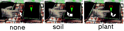
Different cursors depend on what point in the garden the cursor is over
Buttons are places on the screen that look as if they are raised and generally have a
word or picture inside. When you click with the mouse when the cursor is inside a button, something will
happen. What happens depends on what the button says inside it. In these examples, the New button
makes something new, and the question-mark button brings up the help system. You would click on either
of these buttons to make them work.
 
Examples of buttons
Check boxes are square areas on the screen that can be checked (with an X or
checkmark inside them) or unchecked. A check box represents some option you can turn on or off. Check
boxes usually have some words to the right or left of them that tell you what option you are turning on or
off. In this example, the check box determines whether pictures are shown or not. You would click on this
check box to turn pictures off.

Example of a check box
Radio buttons are like check boxes in that you turn them on or off. Radio buttons,
however, work in radio groups. Only one radio button in a group can be turned on at any time.
They are called radio buttons because they are like the radio station buttons on a car radio (only one can
be pushed in at a time).
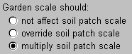
Example of a group of radio buttons
Edit boxes are simply places on the screen where you can type in letters or
numbers using the keyboard. The letters or numbers you type will be used by the program to determine
how something is done. Usually there is a description of what you are to type in the edit box above or
beside it. In this example, the number of undo levels can be edited. You would click with the cursor inside
the edit box, then type on the keyboard to edit the number.
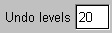
Example of an edit box
List boxes are areas on the screen where a list of choices is presented. You cannot
edit these letters or numbers as you can the contents of an edit box; you can only choose one of the items
on the list. If more items are in the list than will fit in the space provided, scroll bars will appear on the
list box. List boxes can also include pictures or even check boxes on each line. You always select a choice
from a list box by clicking on a line; the line you have selected is shown colored. In this example, you
would choose an item from the list by clicking on one line.
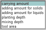
Example of a list box
Drop-down list boxes are the same as normal list boxes, only they are collapsed
down to one line to save vertical space. Clicking on the box opens, or drops down, the whole list,
from which you can make your selection. The item you have selected always shows when the drop-down
list box is collapsed. In this example, the "magnifying glass" item is selected.
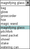
Example of a drop-down list box
Combo boxes are thus called because they are combinations of edit boxes
and drop-down list boxes. There is a list of choices that drops down just like the drop-down list box, and
you can choose an item from the list. But you can also type directly into the box as you would in an edit
box, and the letters or numbers you type will be used for whatever option you are editing instead
of any of the items in the list. In this example, the "1.0" item is selected from the list, and it has
not been edited. You would either choose another item from the list by clicking on that item, or type over
the number in the editable section of the combo box at the top.
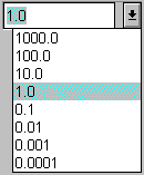
Example of a combo box
Note: For brevity, both combo boxes and drop-down list boxes are often called simply boxes in this
help system.
Panels are simply areas on the screen that have rectangles around them to differentiate them
from other areas on the screen. A panel tells you that an area is used for some purpose. Panels are often
labeled with words that describe what the panel contains. In this example, the panel describes a hotspot
and contains two edit fields. You will not normally interact with panels; you will interact with the items
they contain.
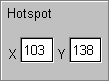
Example of a panel
A header is a special type of panel that sits over a list box with columns and allows you to
change the relative sizes of the columns in the list box by clicking on one of the lines between the columns
(on the header) and dragging to the right or left.

Example of a header
Sliders represent a number as a distance along a line and are used mainly in browser components. Sliders generally are associated with a number below
them with a unit, and with two numbers at each side showing the
bounds which the line represents. If the slider represents a quantity you can change, there will be a button
as in the picture above; click on the slider and drag to the left or right to change the value. If there is no
button, you cannot change the value.

Example of a slider
Dialogs appear when the program needs some information from you to do
something. A dialog is really just a window, but the term generally is used to mean a window that appears
to ask you a question and then goes away when you have answered the question. Notice that the term
dialogue means "conversation". Dialogs can take many forms, from a simple yes/no
question to a complex set of options. Generally dialogs are closed by clicking on an OK button to
accept your input and continue what you are doing, or by clicking on a Cancel button to either
stop what you are doing or to abandon the changes you made inside the dialog. Often dialogs are
modal, which means you cannot do anything else in the program until you close them. If you
click on another window of the application when a modal dialog is open, the computer will beep. In this
example, clicking OK will change the name of a soil patch.
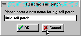
Example of a dialog
| 